This page describes the use of LiveView Desktop charting view. Charting view queries let you examine your data with various visual representations, such as heat maps, line graphs, pie charts, and many other views.
Note
LiveView Desktop charting view requires Apple Java 1.6, Java 1.7u40 or higher, or Java 1.8. Charting capability is not available when using Java 1.7u39 or lower.
This section uses the Hello LiveView sample and shows important features of the charts provided the example's preconfigured workspace. Load and run the Hello LiveView sample as described in Getting Started with LiveView Server.
LiveView Desktop opens on a workspace with several views. The chart in the preconfigured workspace for the Hello LiveView sample contains a pie chart that looks something like this:
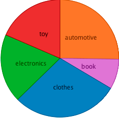 |
This chart shows the relative number of items in the top-selling categories, with each category shown with a different color. Your chart will not look exactly like this one since the amounts are generated with a feed simulation that uses a random number generator.
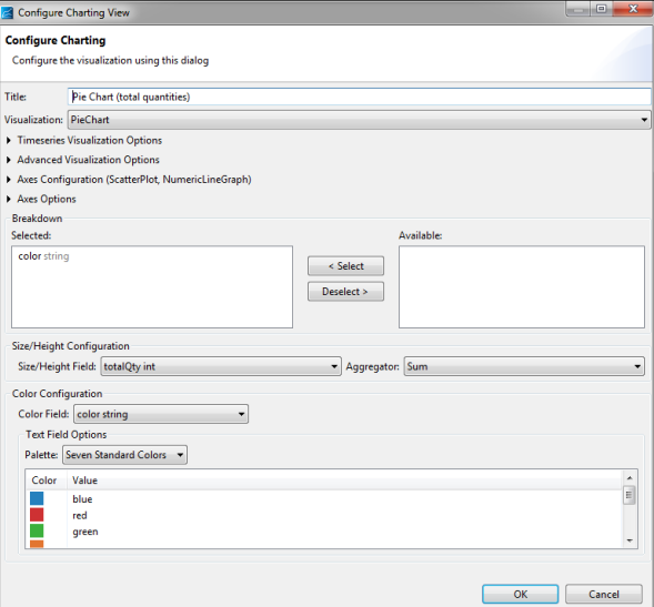
LiveView Desktop charting queries are configured through the Configure Charting View dialog. Click on the Configure button (![]() ) in the query view's toolbar to open the Configure Charting View dialog.
) in the query view's toolbar to open the Configure Charting View dialog.
LiveView Desktop provides tools to control the open chart view.
-
The toolbar for a charting query contains custom buttons:
-
The Show Color Legend button (
 ) toggles the color legend on and off.
-
The Show Time Series Ruler button (
 ) is active when the chart is a time series plot.
-
The Palette drop-down menu includes a palette with colors friendlier to those with color blindness. As before, the Palette selection affects any chart type you configure for the current view.
 |
The LiveView Desktop standard chart types are shown in the following table.
| Name | Description | Example |
|---|---|---|
| Treemap |
Treemaps display large amount of hierarchical data as colored rectangles on a grid. The size of a field reflects its importance. The color conveys another property. This example shows a Treemap chart configured against the Items table. |
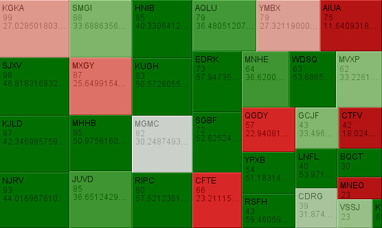 |
| Heatmatrix | Like a treemap, but represents each data group as a rectangle. The color of the square corresponds to the importance. |  |
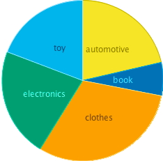
| Pie chart | Displays quantities as parts of the whole. | 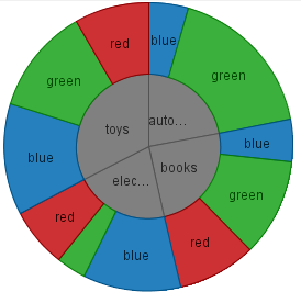 |
| Bar graph (horizontal) | Length represents quantity. | 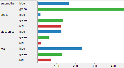 |
| Bar graph (vertical) | Height represents quantity. | 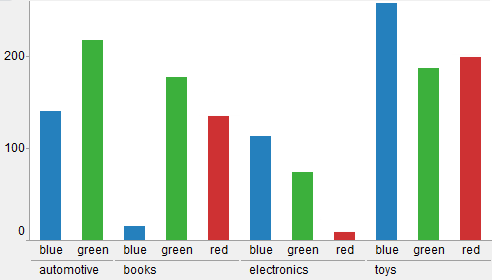 |
| Scatter plot | Plot on two axes, with size and colors for additional quantities. | 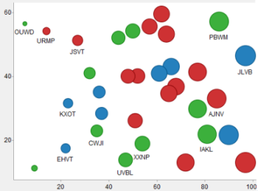 |
| Shapes | Display data for an SVG path. These plots show how both physical location and size are important by showing geospatial correlations. | 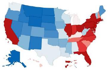 |
LiveView supports the following time series charts. For these chart types, the table must have one or more fields of type timestamp. The timestamp field is represented on the horizontal (X) axis.
| Name | Description | Example |
|---|---|---|
| Line Graph | Dependent variable represented as a point. The height of the point represents the quantity of interest. Successive points are connected by straight-line segments. | 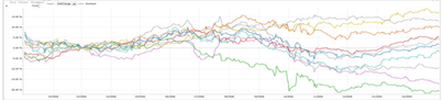 |
| Needle Graph | Dependent variable represented as a vertical line. The height of the line represents the quantity of interest. | 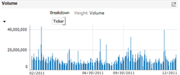 |
| OHLC (Open-High-Low-Close)/Candle Stick | Time-based price distribution for a specific time window. For each time window, the highest price, lowest price, opening price, and closing price are shown. | 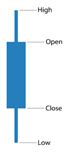 |